Project Summary:
The Sharpie brand created a new line of bold, vibrant colors that were chosen based on CMF research and the trend of Y2K coming back into popularity. With these new colors, the team wanted to create a pattern for the packaging that evoked the new digital Y2K fad while also still staying within the Sharpie packaging style guides.
My Role:
Lead packaging concepts from mood boards, pattern exploration, color palette exploration, badge/type creation and final execution of packaging.
Packaging
Pattern Making
Mood Boarding
Badge Mark Creation
Pattern Making
Mood Boarding
Badge Mark Creation
~ More conceptual work can be shown in person due to NDA
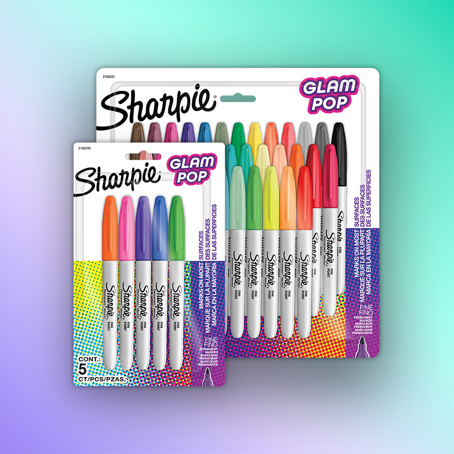
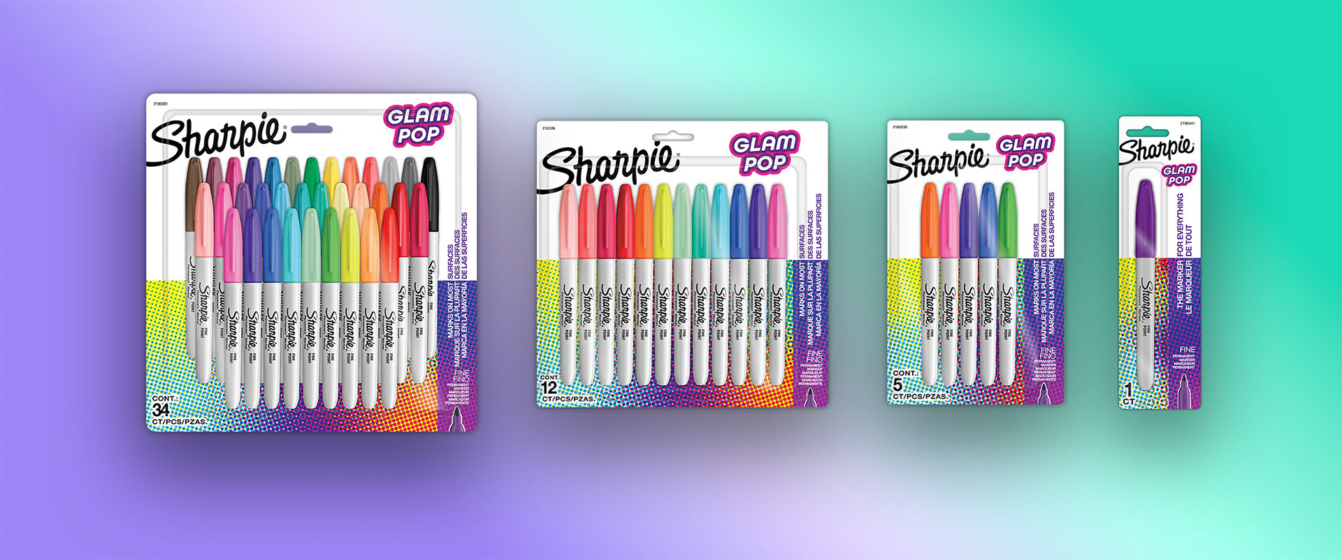
The project started with exploring 4 main styles of patterns that would align with a bright, vibrant new Y2K look. I explored Prismatic Lighting, Metallic Hologram, Iconic Collages, and Tech Textures as styles of patterns along with badge mark / custom type to match the style. The team landed on a tight halftone style pattern to allow for a bright and engaging pack that also allowed clearly allowed the product to shine.
Click below to see how our team used this work as a benchmark to build out photography and video for the PDP and web.