Project Summary:
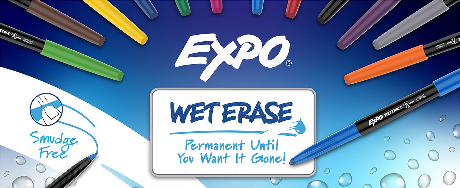
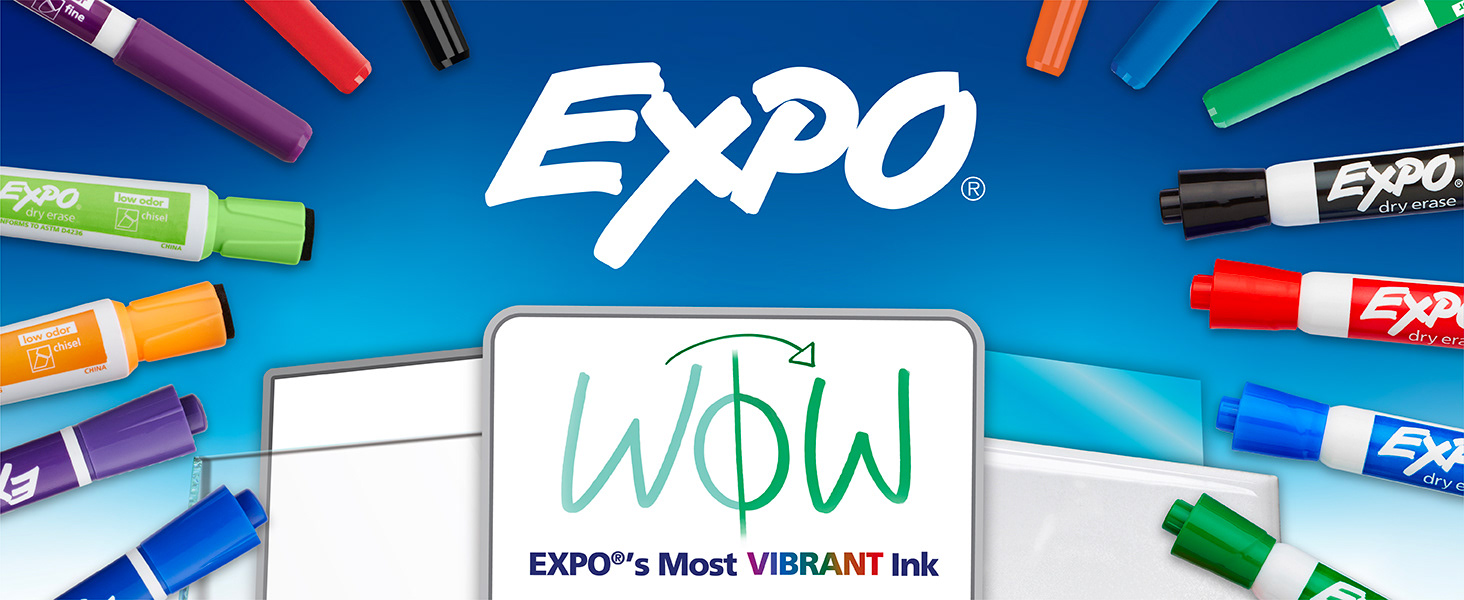
EXPO has been a standard in homes, schools, offices and more for years. With the external facing assets beginning to look dated, this project sprung to life bringing a new innovation with it. For Dry Erase it was better ink formulas for EXPO's most vibrant ink yet. For Wet Erase, it was bringing attention back to the "Vis-a-Vis" we all knew from overhead projectors and expanding it's use cases. This project all started with a brainstorm, ideating just how far the team could take EXPO. Reeling it in from there, how do we still evoke EXPO and history that consumers have become loyal to?
My Role:
From joining the team brainstorms a year prior to the actual new ink activation refresh, I was there from the start. Developed brand style and concept work for print & digital assets. Execution of leader SKUs as examples for broader distribution of style across all packs. Built storyboards & shot lists and worked with the studio team in finding talent, props, and execution and direction of photography and video. With all digital photography & video captures, worked to execute PDP tiles and assets for retail.com.
Brand Development / Refresh
Packaging
Photography & Video Direction
Digital Retail Assets
Brand Style Guide
CSI Testing
Packaging
Photography & Video Direction
Digital Retail Assets
Brand Style Guide
CSI Testing
~ More conceptual work can be shown in person due to NDA
The Challenge:
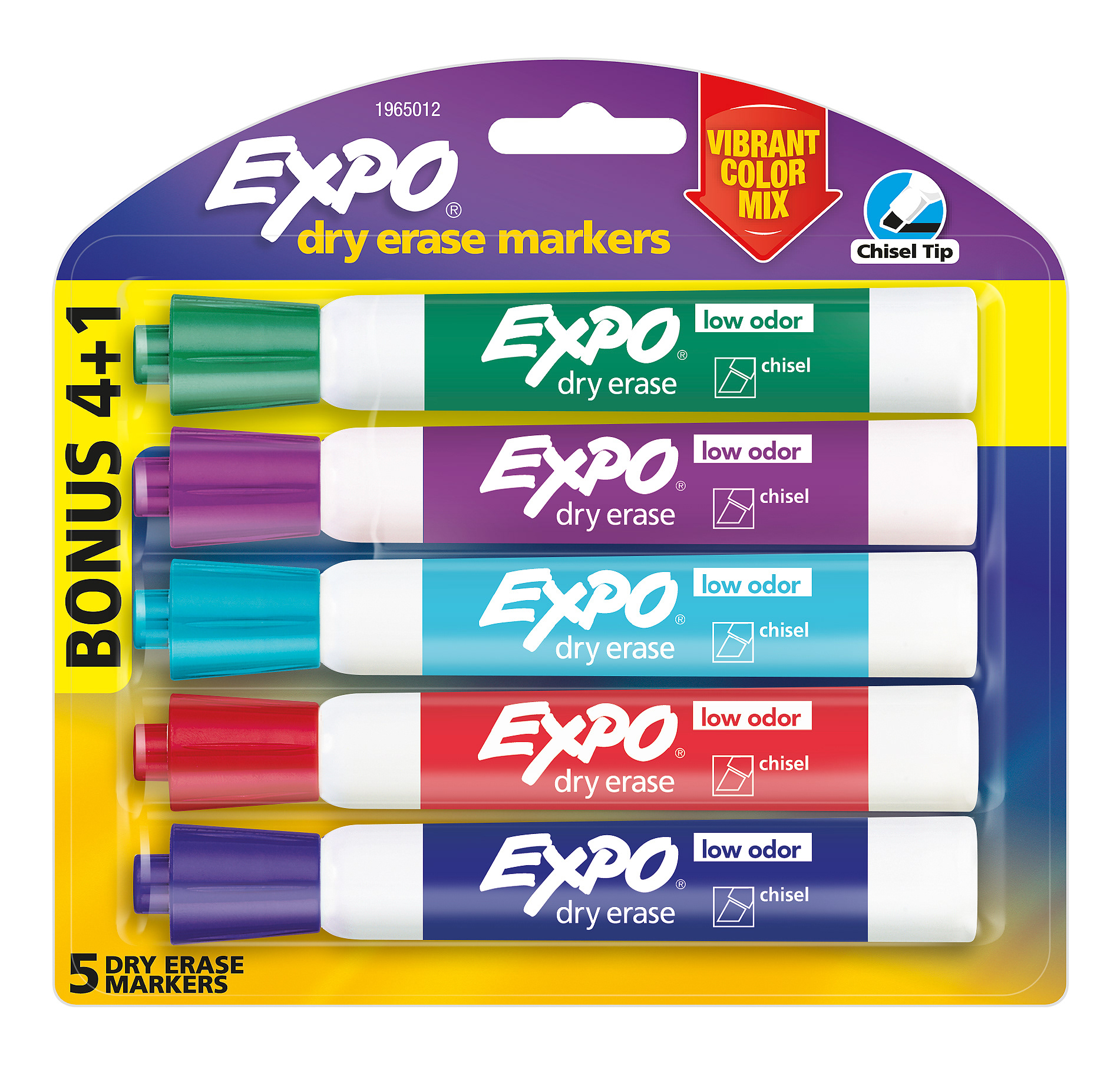
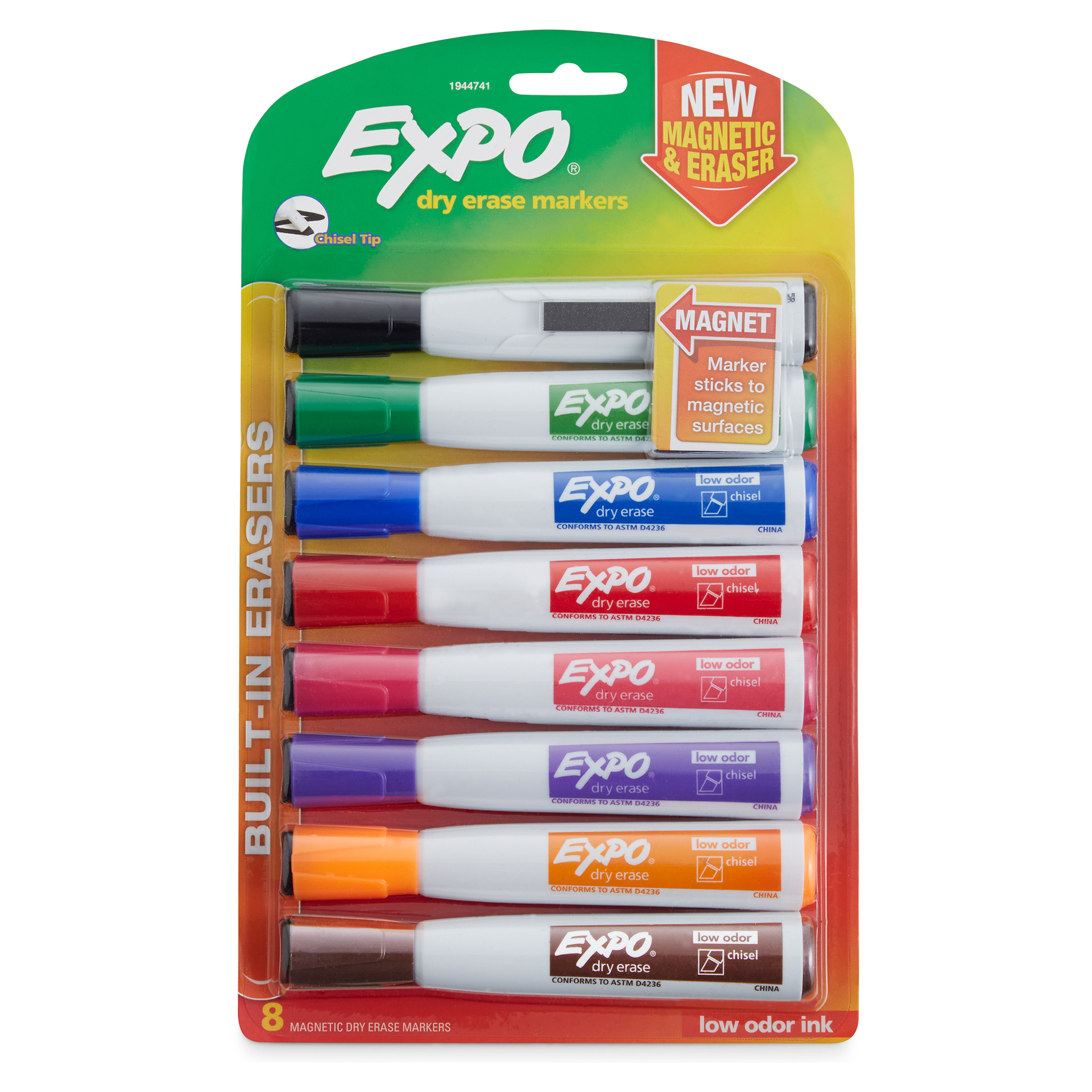
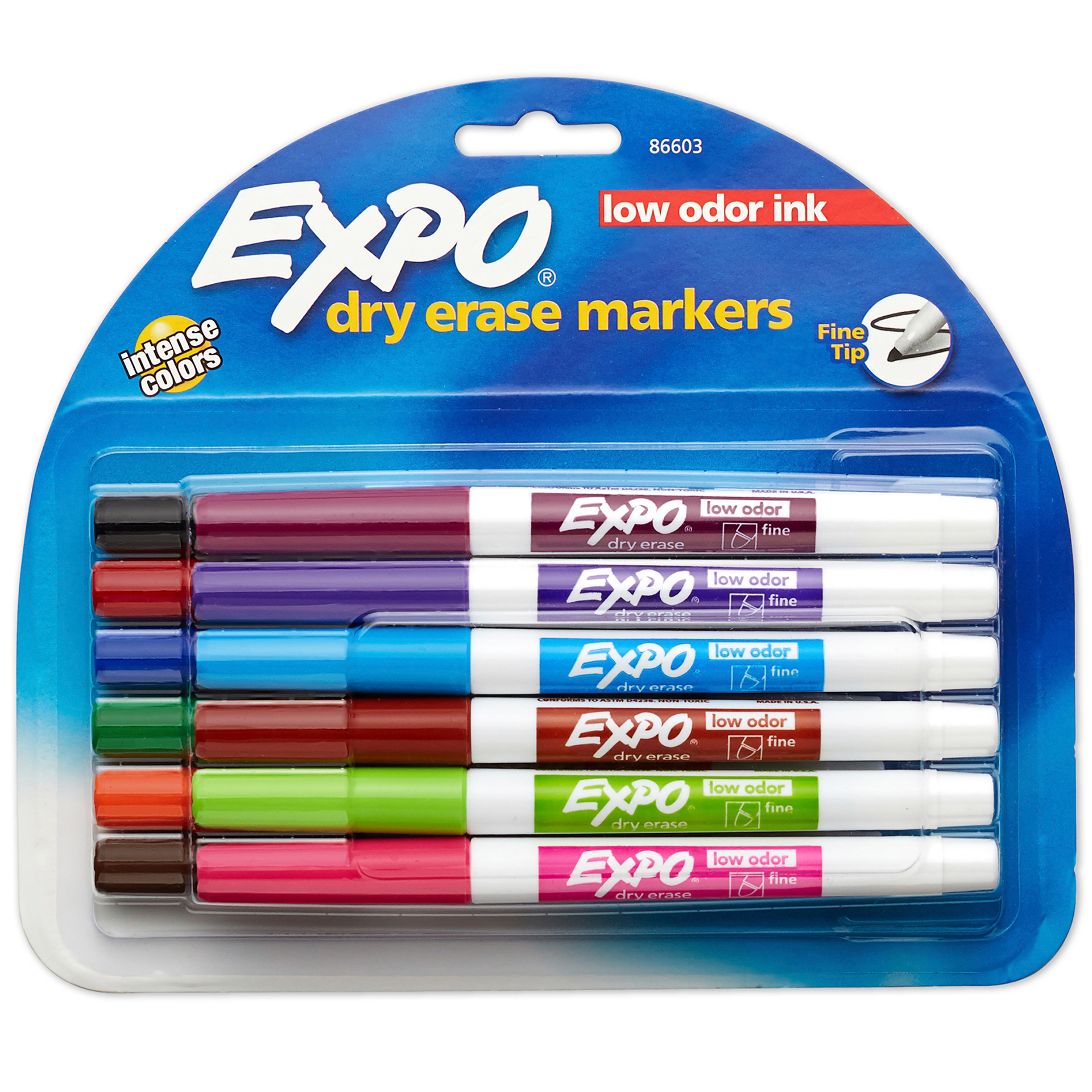
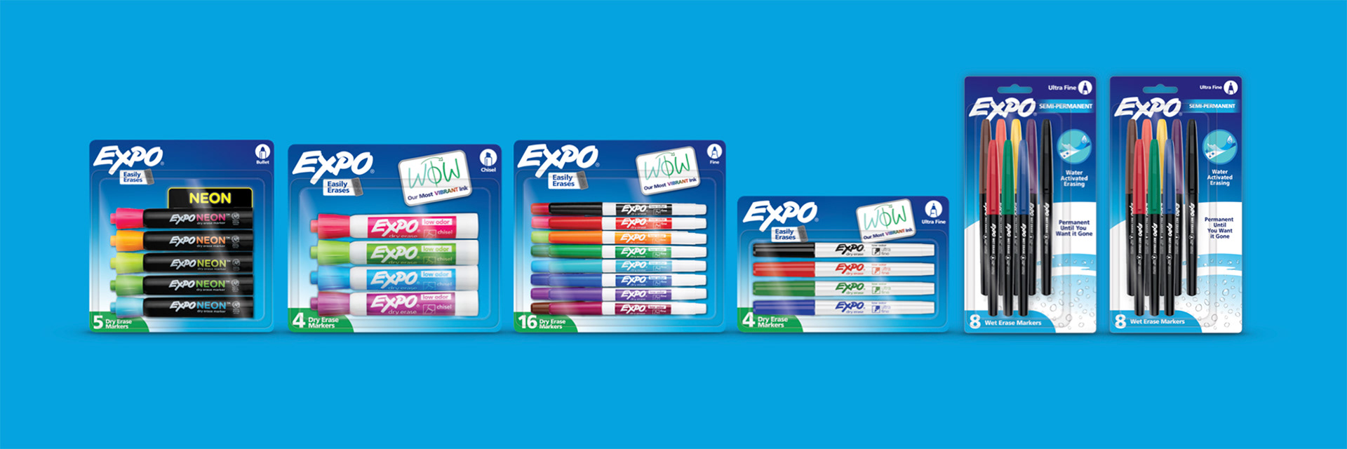
This project was a challenge of refreshing a historic brand with simplifications, order, and consistency across platforms of print and a nearly nonexistent digital. Starting with the packaging, we looked to see what was historic and iconic to EXPO such as the blue and started eliminating inconsistencies and confusion. Building order for our icons, new & old claims, and building a foundation for a consistent background and count callout.
Key Visuals:
Part of the initial work was getting Key Visuals built to sell into stores and build the new style guide idea to present to our brand and marketing team.
~ The above images are not absolutely accurate to conceptual Key Visuals but they can be viewed in person due to NDA ~
Part of the initial work was getting Key Visuals built to sell into stores and build the new style guide idea to present to our brand and marketing team.
~ The above images are not absolutely accurate to conceptual Key Visuals but they can be viewed in person due to NDA ~
Photography & Video:
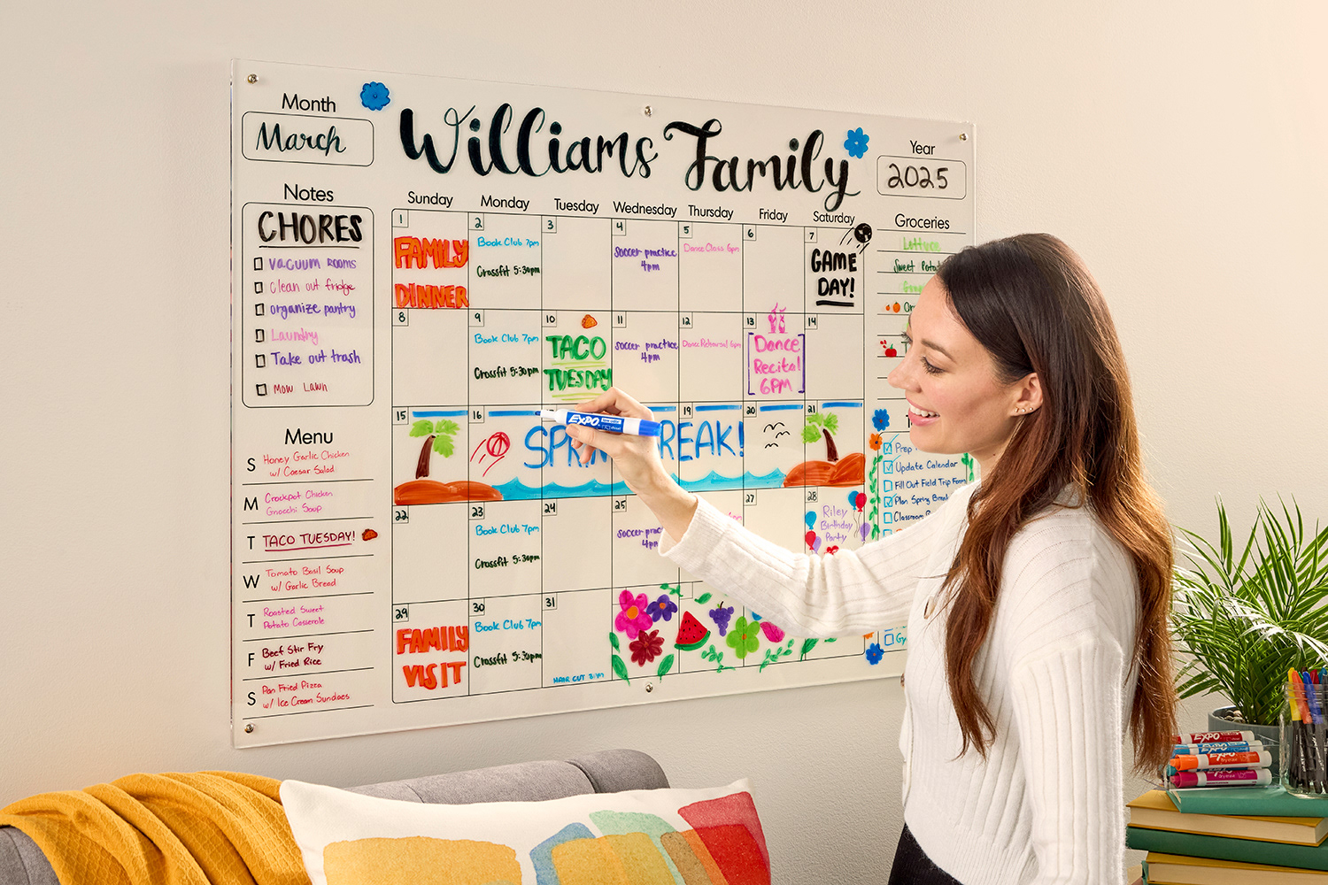
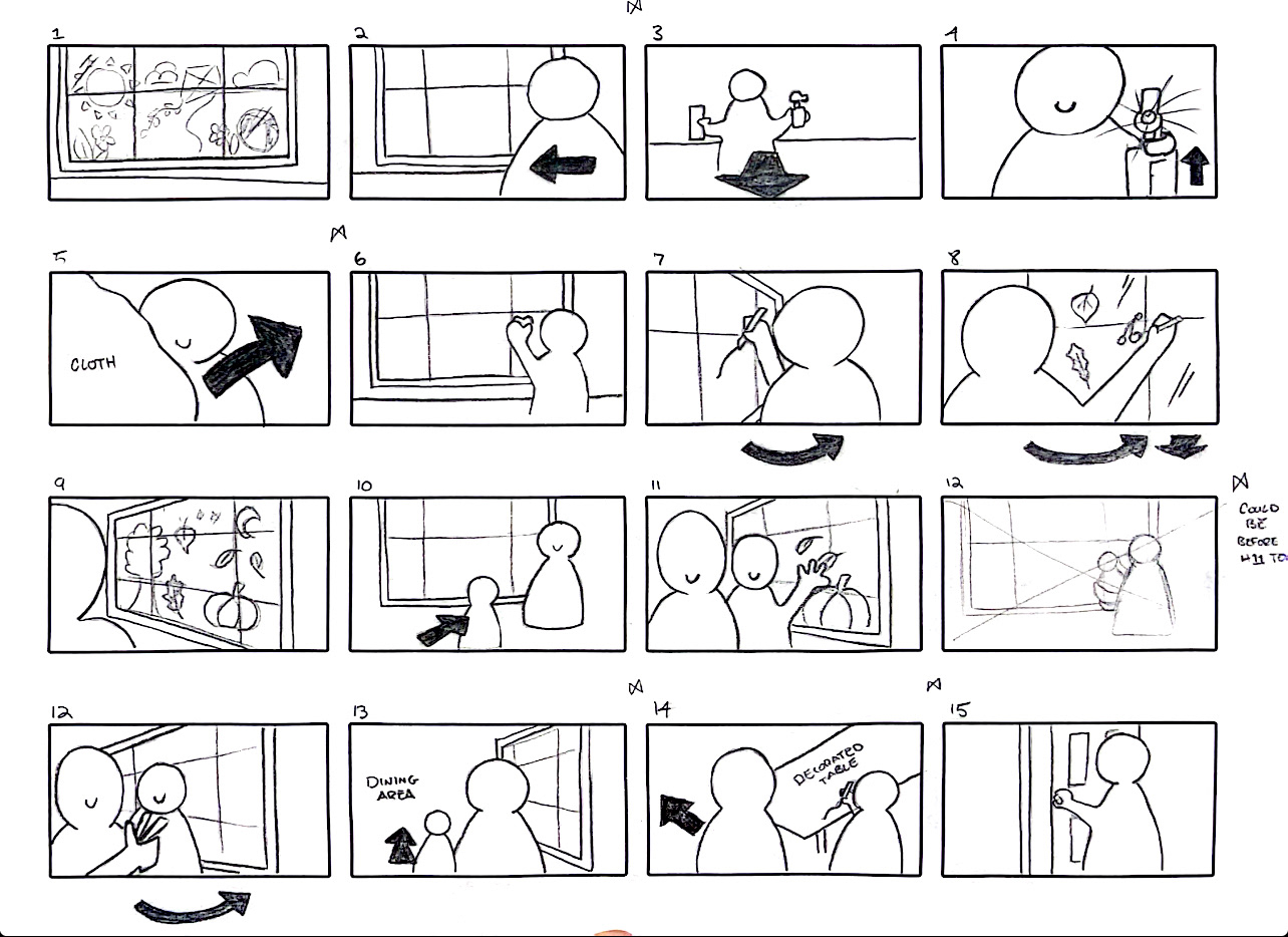
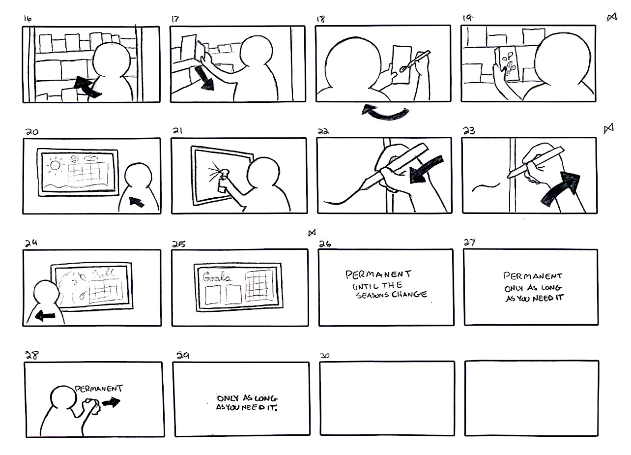
Before working with the studio team, I created shot lists and storyboards for both Dry & Wet Erase. Each shoot and video focusing on the product lines key claim.
Before working with the studio team, I created shot lists and storyboards for both Dry & Wet Erase. Each shoot and video focusing on the product lines key claim.
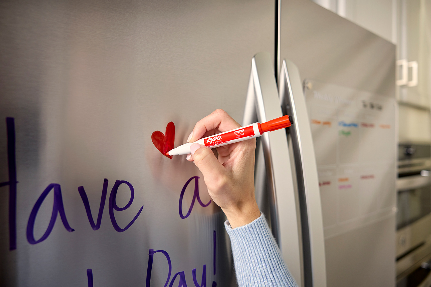
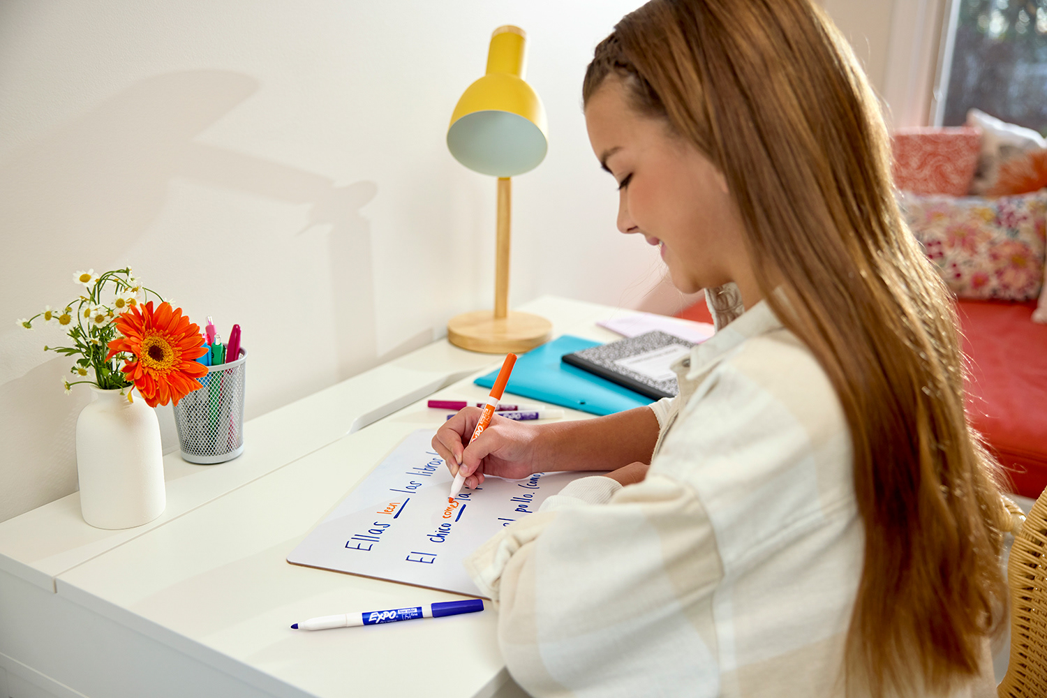
Photography:
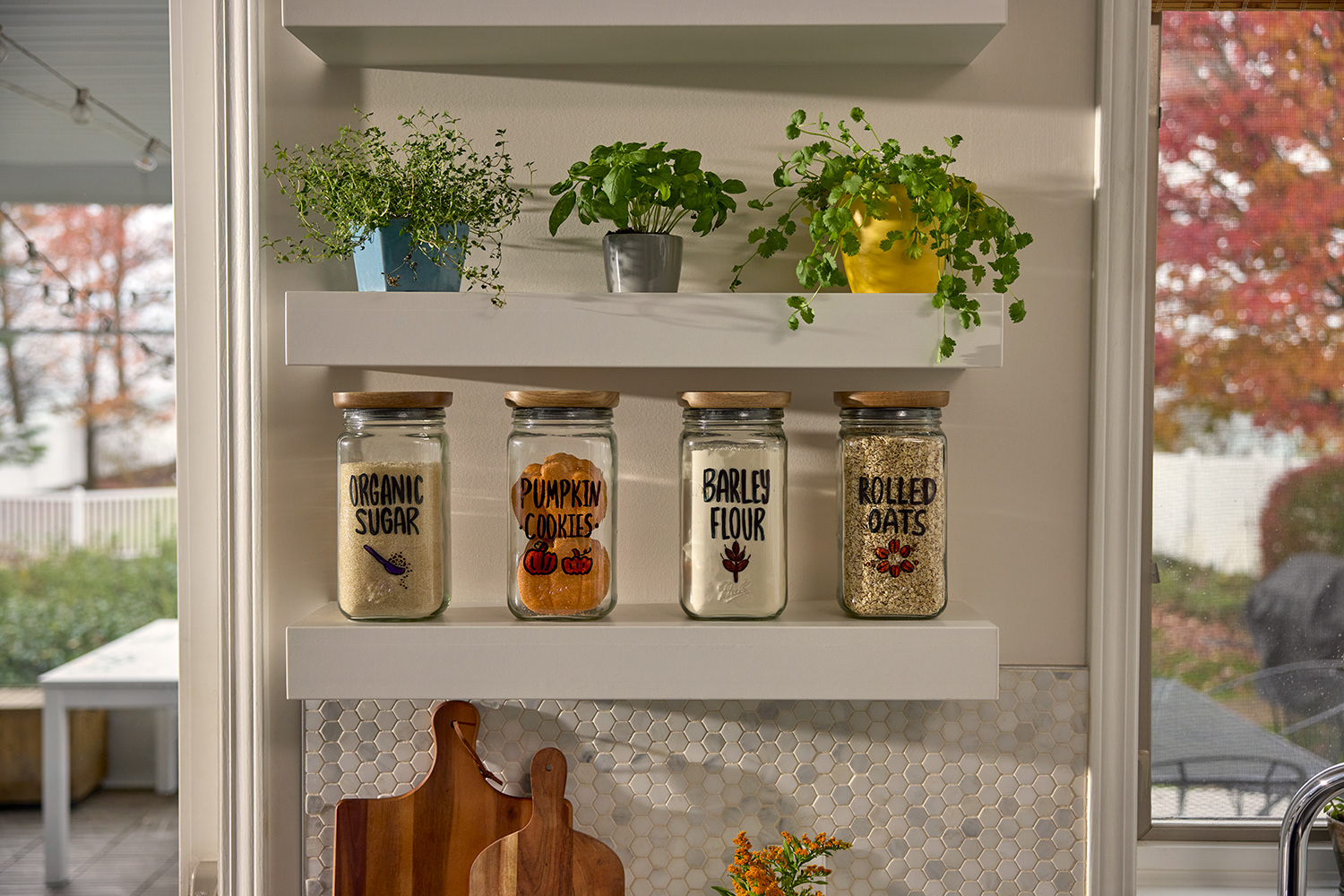
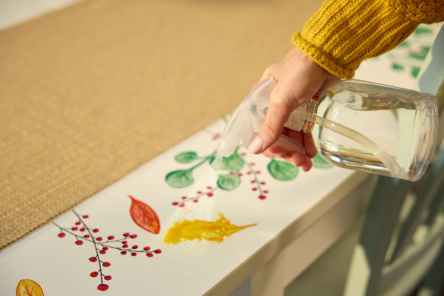
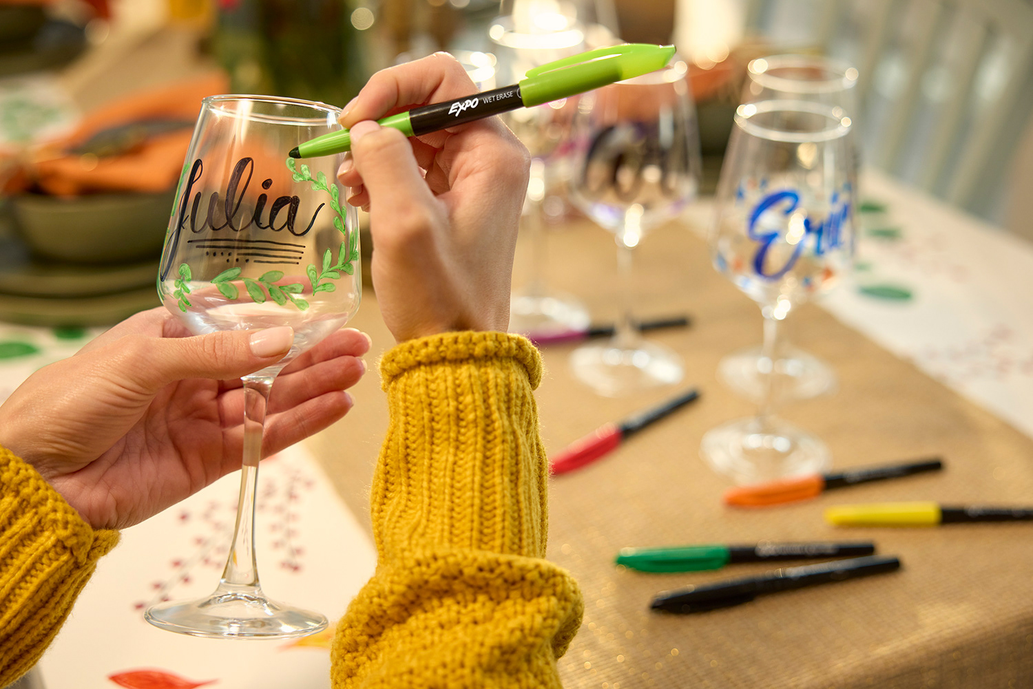
From window art, home use, schoolwork, planning, organizing, office presentations and more. Almost every facet of EXPO consumer use and new ways of using the product was captured in photography to showcase the new ink of the Dry Erase and the versatility of the Wet Erase.
From window art, home use, schoolwork, planning, organizing, office presentations and more. Almost every facet of EXPO consumer use and new ways of using the product was captured in photography to showcase the new ink of the Dry Erase and the versatility of the Wet Erase.