Project Summary:
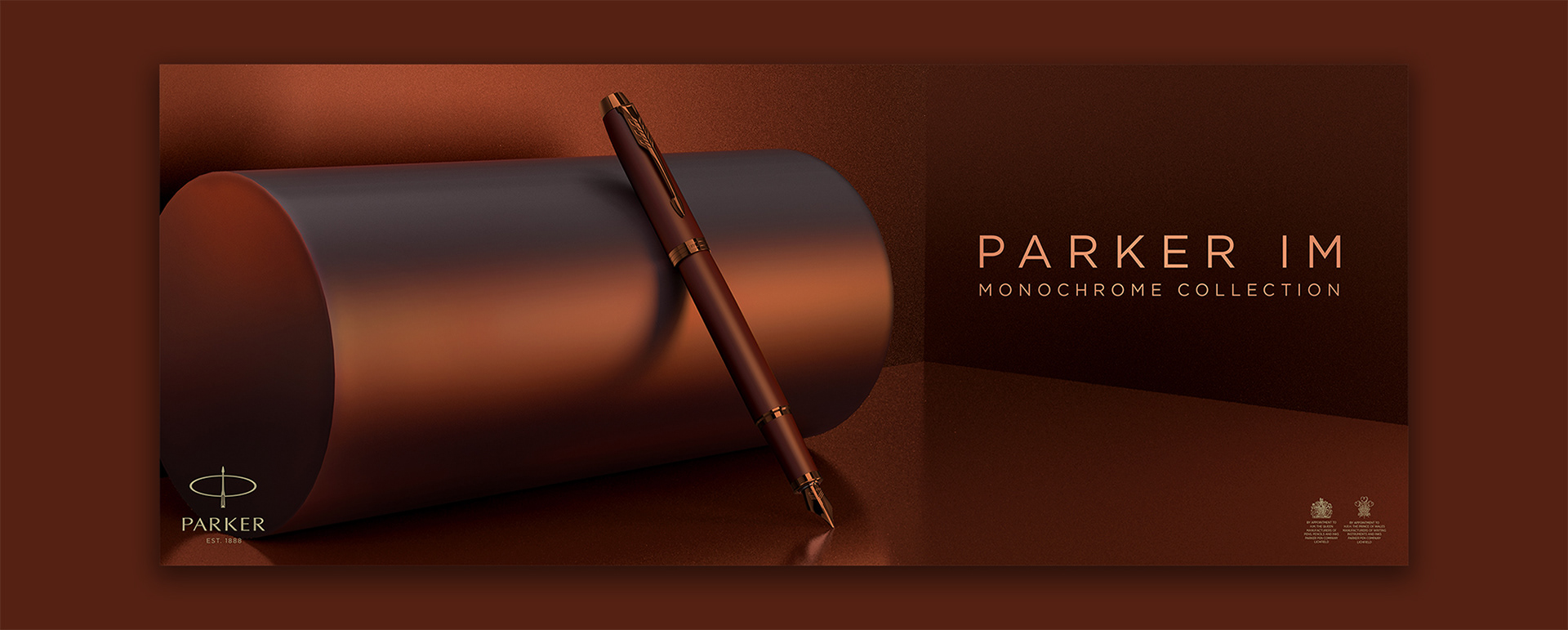
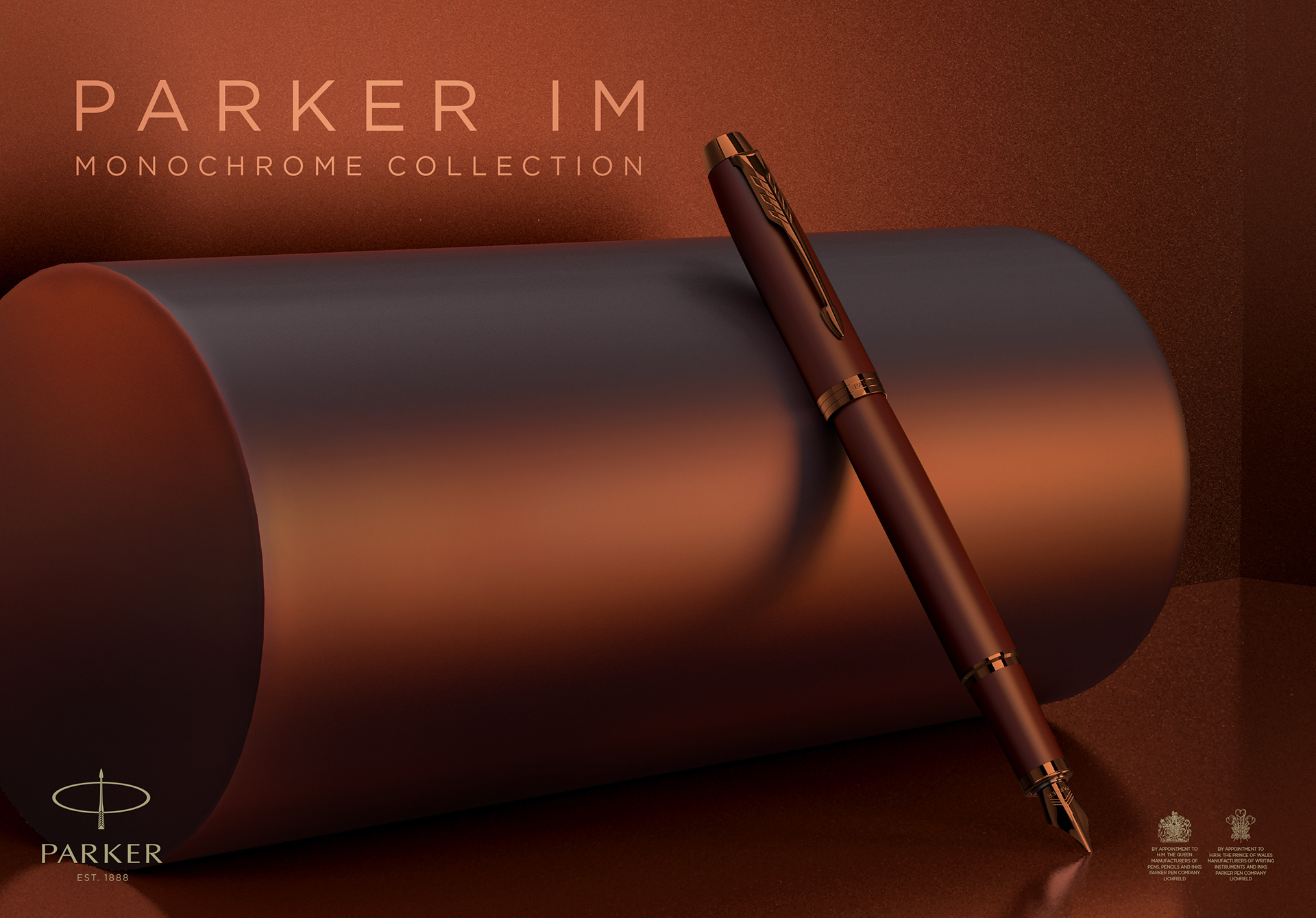
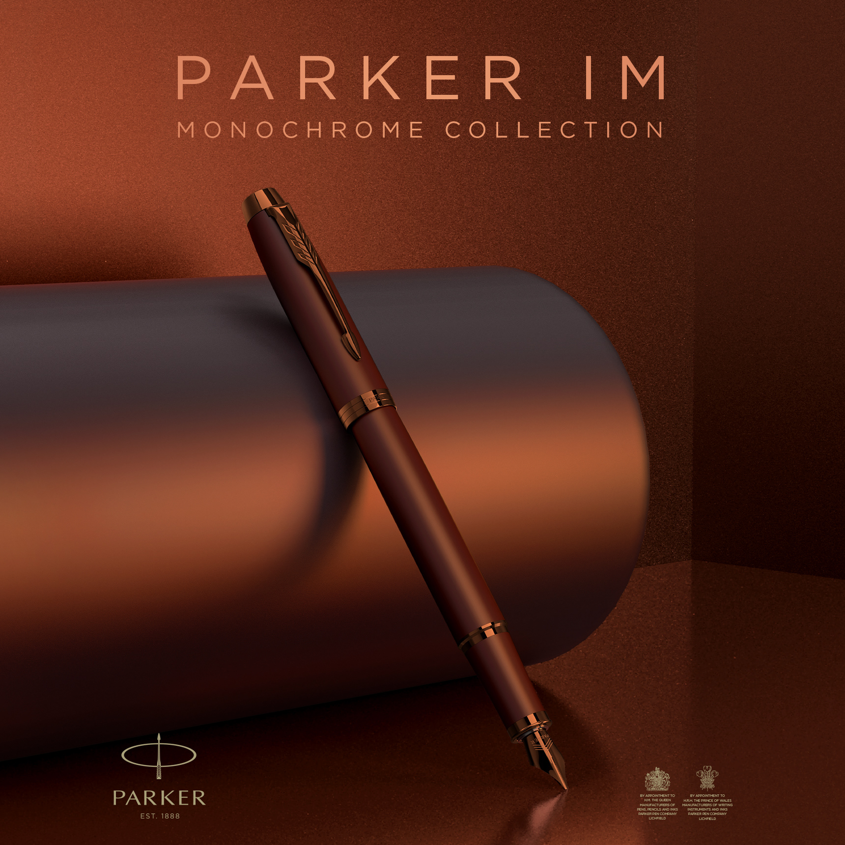
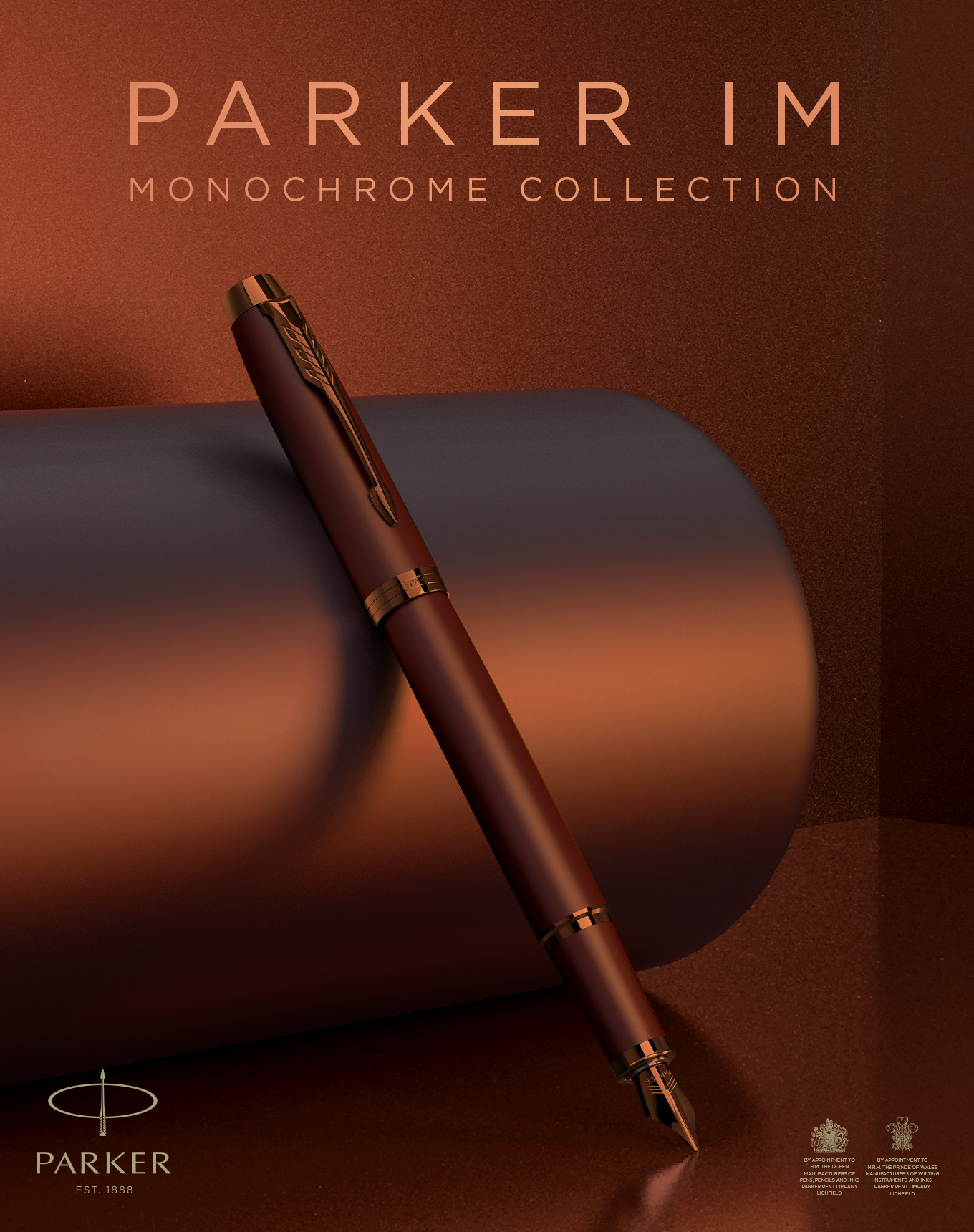
The Parker IM Monochrome Collection was meant to evoke a feeling with a sophisticated personality. When starting on this project, the blue monochrome Parker IM was already in market. The team had chosen a sphere for the blue, a calming color with sophisticated lighting.
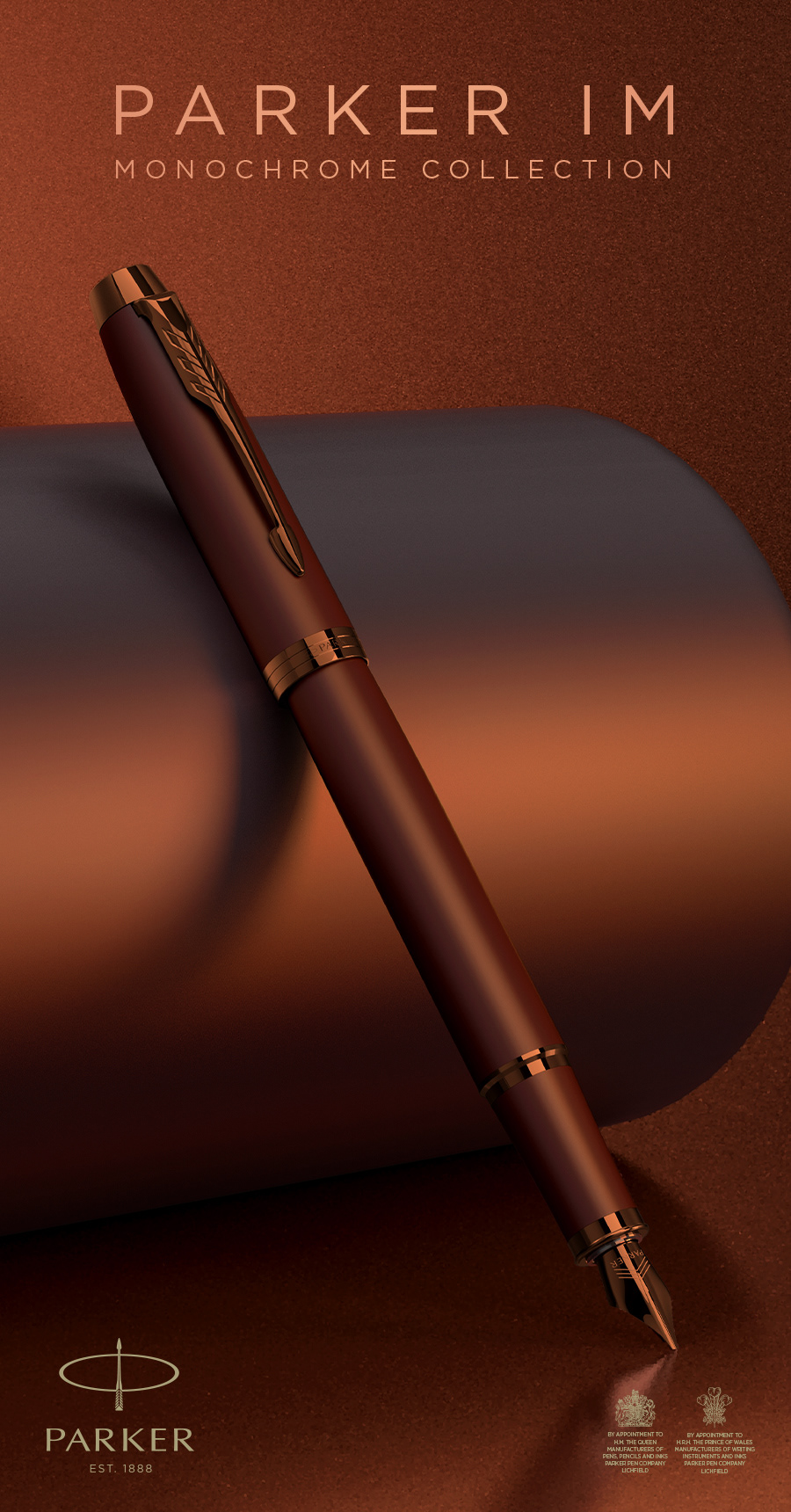
With the burgundy pen, the direction was to evoke more warmth. I focused more on the idea of something that was reminiscent of how we use copper or brass. Industrial with soft lighting to give the pen a refined look.
My Role:
I lead the concept work for layout and choosing which shape to represent the pen. All final renders were created in Keyshot for multiple use cases from print and digital; ensuring we had a variety of size options.
Keyshot
Digital Banners
Digital Banners
~ More conceptual work can be shown in person due to NDA

Renders created in Keyshot for multiple use banners across digital and print formats.